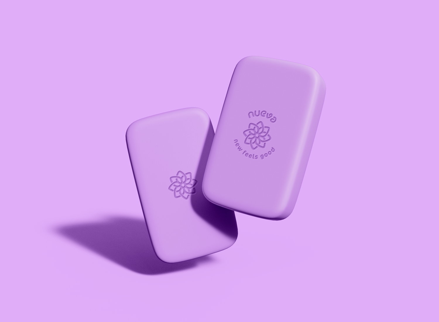
Natural Hair Brand
Female hair care brand looking for a new, exciting logo and branding
The BriefAn up-and-coming female hair care product company looking to make splash in the market with their all-natural products. Nueva were looking for a refreshing new logo and branding to reflect the bright, vibrant, and all-natural feel of the brand. The focus to be using bold colours that represent their natural products.
Project informationClient: Nueva
Services: Logo Design, Branding, Web Assets
The SolutionResearching the word “Nueva” and the direct translation comes the Spanish language meaning New or Fresh. With this I constructed a word map with fresh linking to the natural ingredients in Nueva products and the flowers of these plants blossoming with their fresh smells. For the word new my word map leads me on to thinking about the life cycle of plants, what is need for the seed to grow. How is it given the change to grow into some thing new. The answer to that comes with the addition of water. So, with water brings about new life. After gathering my thought from the word map, I roughly sketched out many ideas of how I could combine the flowers of the ingredients and life giving qualities of water. My final creation of this was to use a droplet shape and repeat itself in a circle to then appear as a larger flower emblem.


