Refreshing Logo
Adding a new shine to a local trade business
The BriefA local window and exterior cleaning company using both traditional and modern cleaning techniques. Services include gutter fascia, soffit, pressure washing, gutter cleaning, conservatory valets & roofs. They cater for both domestic and commercial buildings.
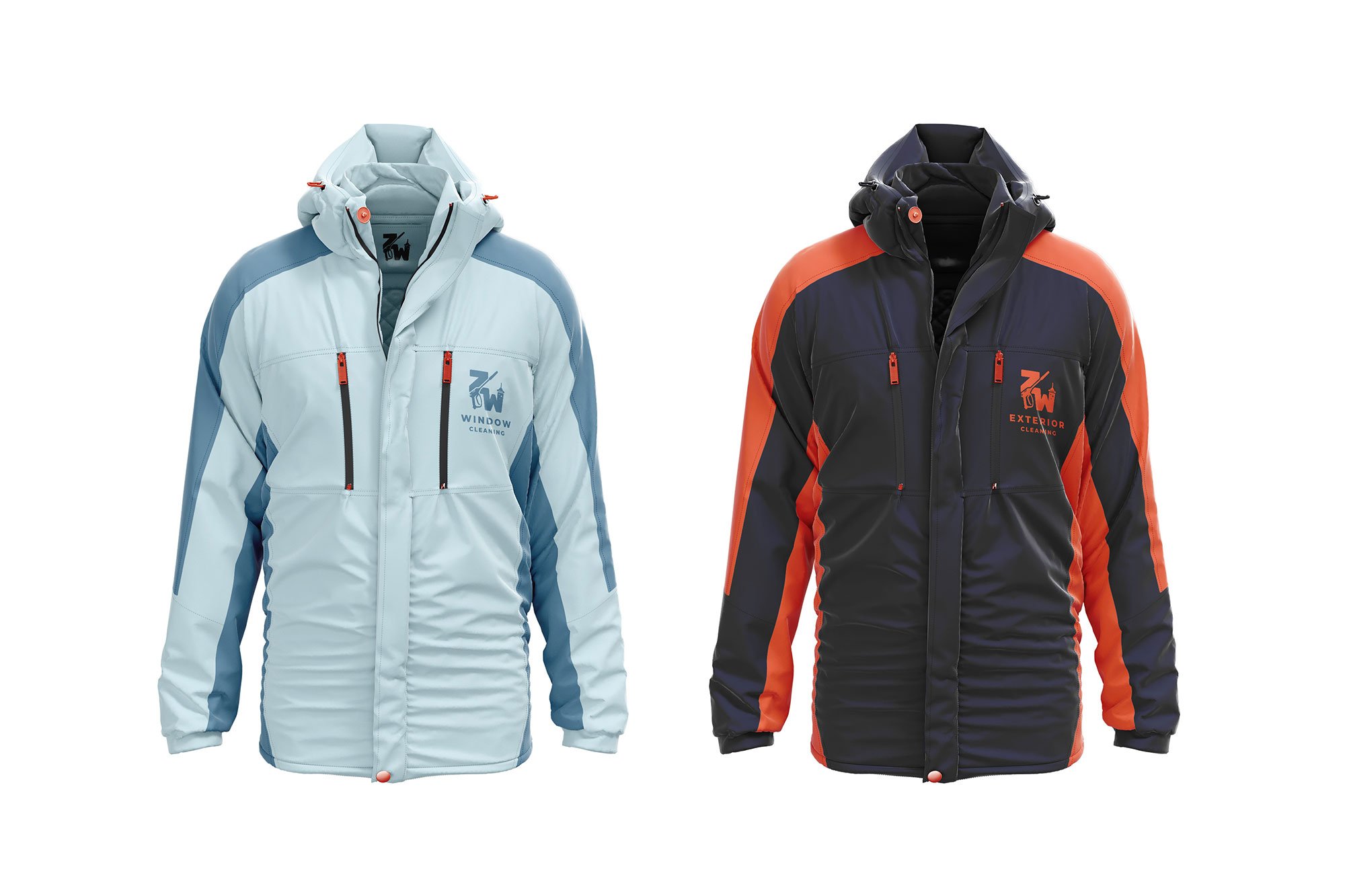
Josh came to me through a mutual friend looking to update his businesses logo. Requesting a more modern, adaptable and not the same as many generic window cleaning logos. The new design needed to be split into two logos of “ZW Window Cleaning” and “ZW Exterior Cleaning”. Josh provided me with a few examples of competitors and general logos he wanted me to take inspiration from.
The new logos needed to include aspects of traditional or modern window and exterior cleaning techniques. With multiple forms to be used for social media, print media, vehicle signage and embroidery on work clothing.
Project informationClient: ZW Windows
Services: Logo Design, Branding, Work Apparel
The SolutionFirst Draft - Rejected
Drawing inspiration from the traditional window cleaning squeegee, I thought about how a clean strip is left behind when removing the water to create the ‘ZW’ lettering. Using lines following the squeegee to replicate the motion of cleaning windows with a slightly uneven beginning to the ‘Z’ also showing the direction of motion. The lines I felt could be used as a pattern in other parts of the branding.
Josh enjoyed my explanation of the thought process behind this idea but felt that the design only visualised window cleaning and not other services of the company. Also asking when including additional services into the logo that they have a more realistic appearance. He also had concerns with the point at which the ‘ZW’ letters intercept each other and that the lines would make it hard to read the main lettering.
Second Draft - Accepted
Using the feedback shared from Josh, I set about implementing these into an adapted design. Keeping the continuous motion flow of the squeegee to create the ‘ZW’ letters but making the lines a solid strip with a few cleaning sparkles by the squeegee. I updated the squeegee to resemble a more realistic version. To include some other services in the design I thought about what equipment Josh is using when out on a job. The most obvious was a pressure washer which with the new arrangement of the ‘ZW’ letters fit nicely in the design.
Success! Josh was so pleased with this updated design and asked me to push forward with creating some mockup design with a new colour palette.


